Trust, Time, and Money—
the Cost of Deprioritising Usability

1x Product Design

1x PM

1x InfoSec


2x Leadership
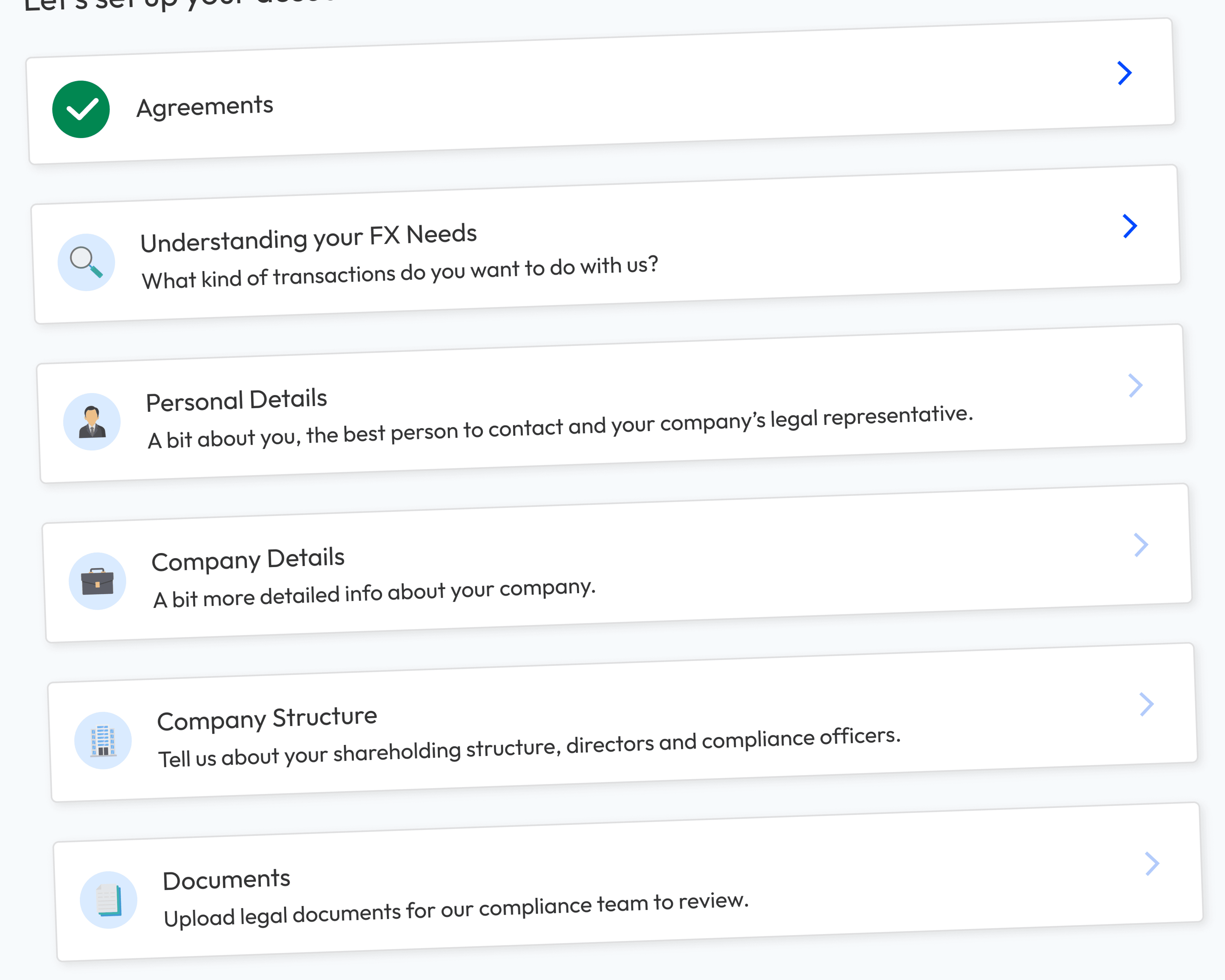
The Problem
Three Unexpected Requirements Increased the Scope
Tight Deadline, Tough Decisions
As front-end devs weren't free for half the project, to ensure we hit the April deadline, we made three decisions:
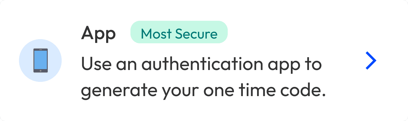
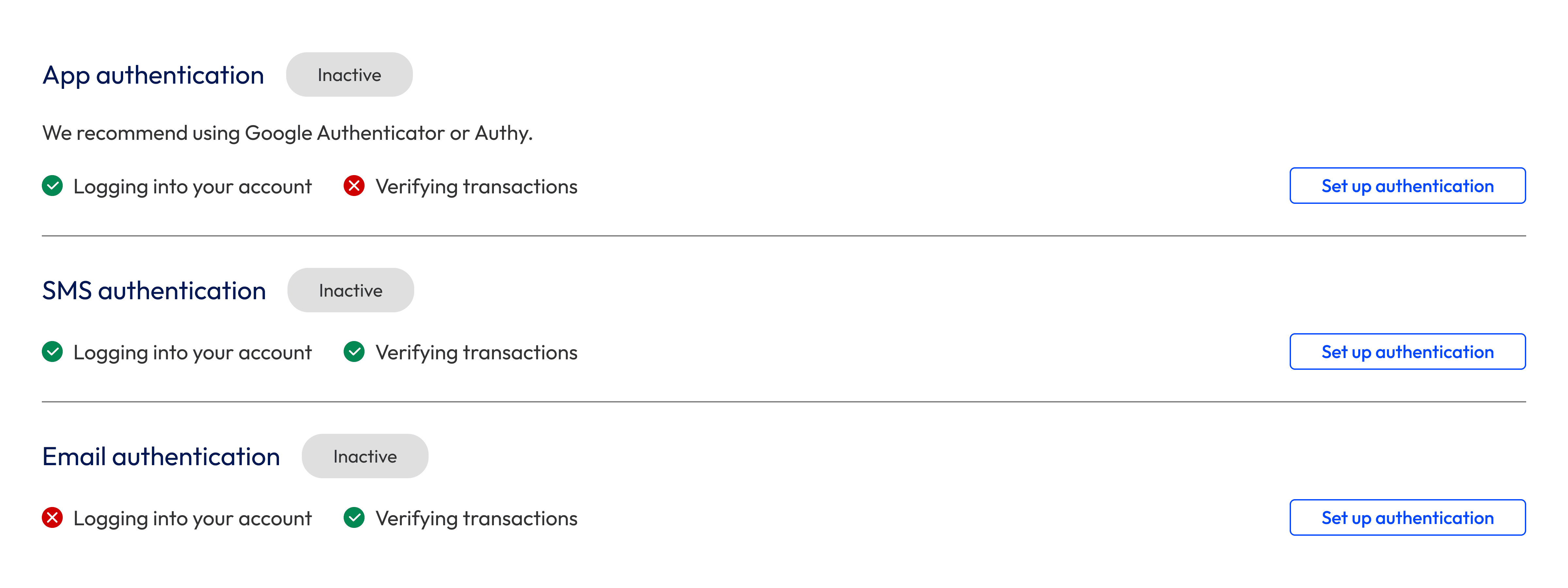
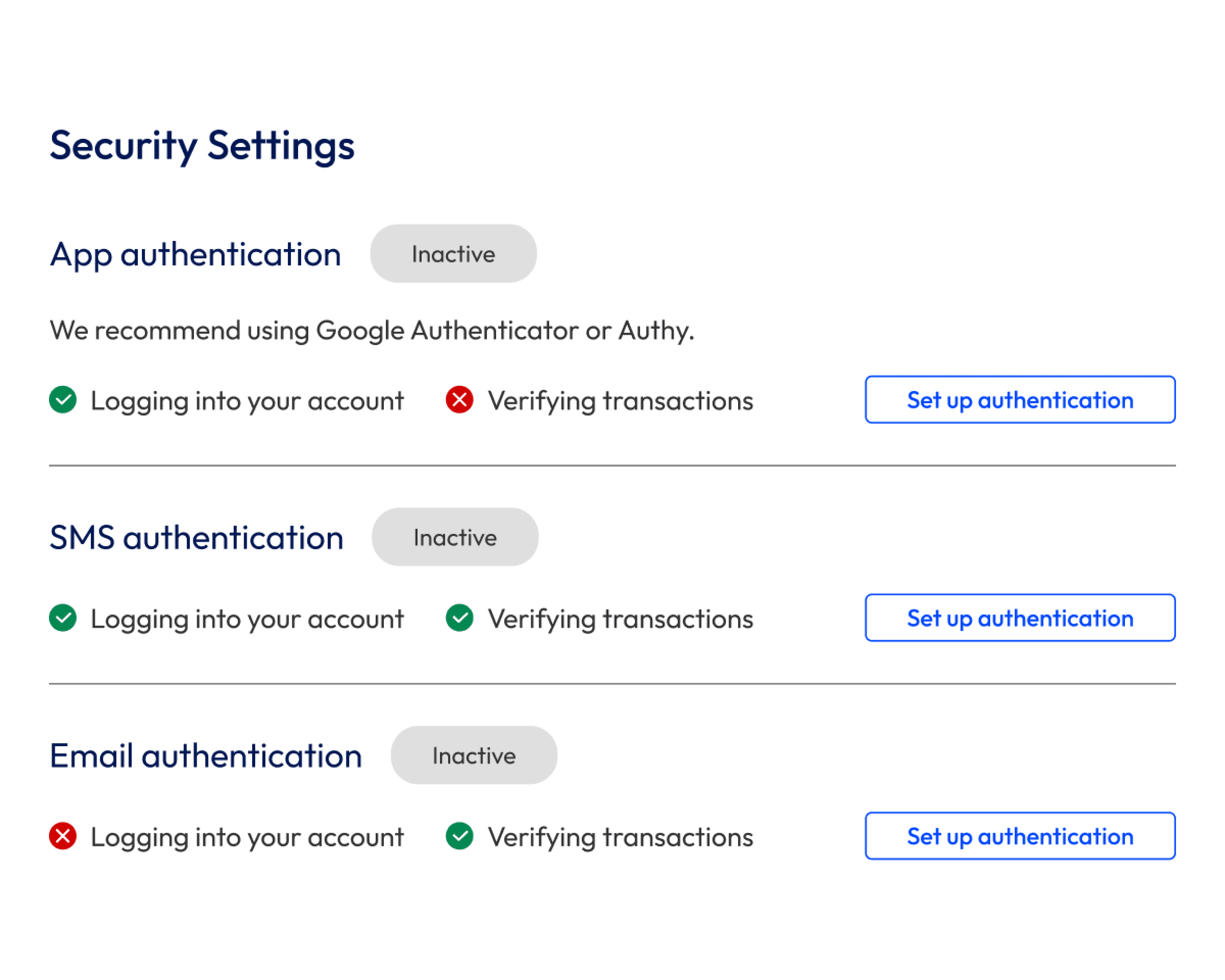
Too Secure to Be User-Friendly
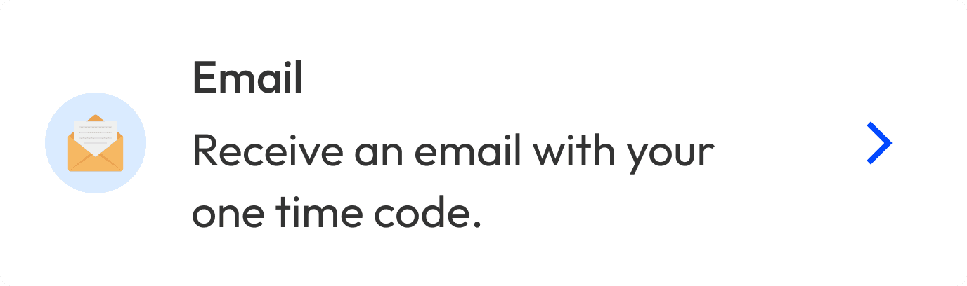
The most secure way of logging in is with a two-factor authentication code from an authentication app. When Engineering and InfoSec pitched this as the sole way to log in, the customer service team pushed back.
Most of our West African users:
To make logging in both a secure and user-friendly experience, people could choose whether they wanted to log in with an email or app 2FA code. With so many stories about SMS not being secure, we decided not to offer it.
Explaining Things Raised More Questions Than It Answered
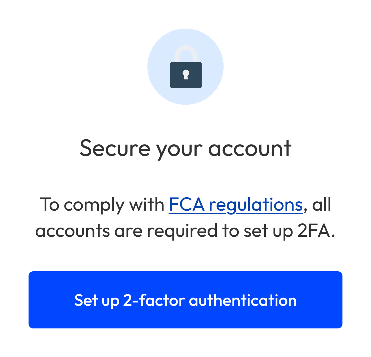
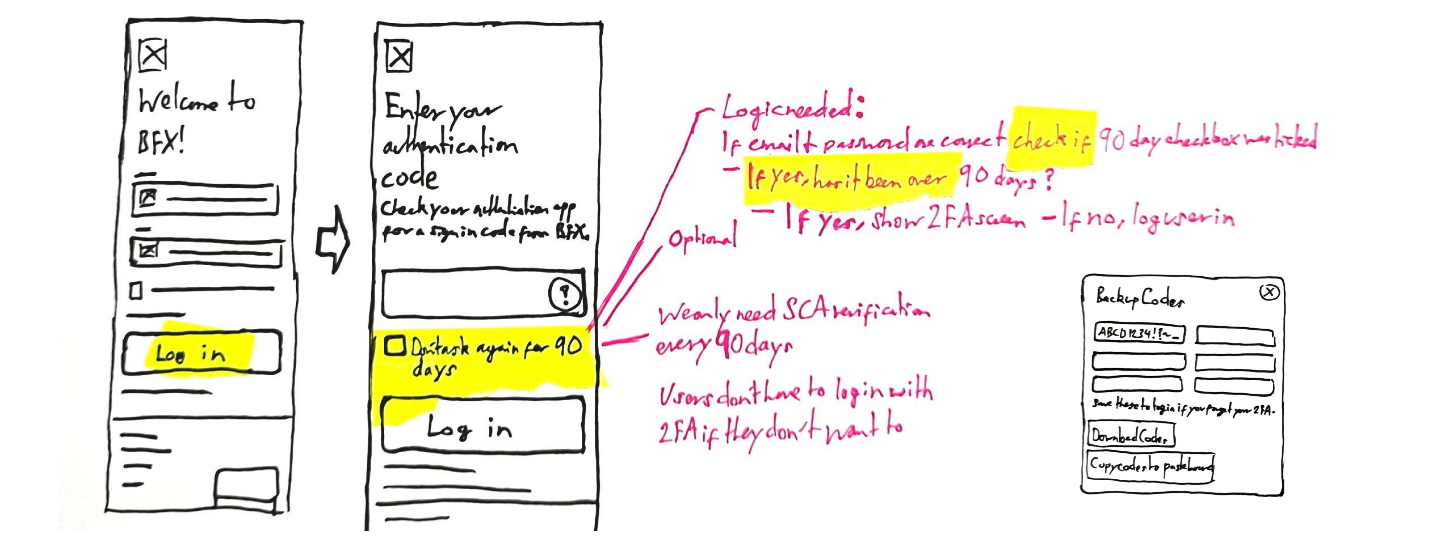
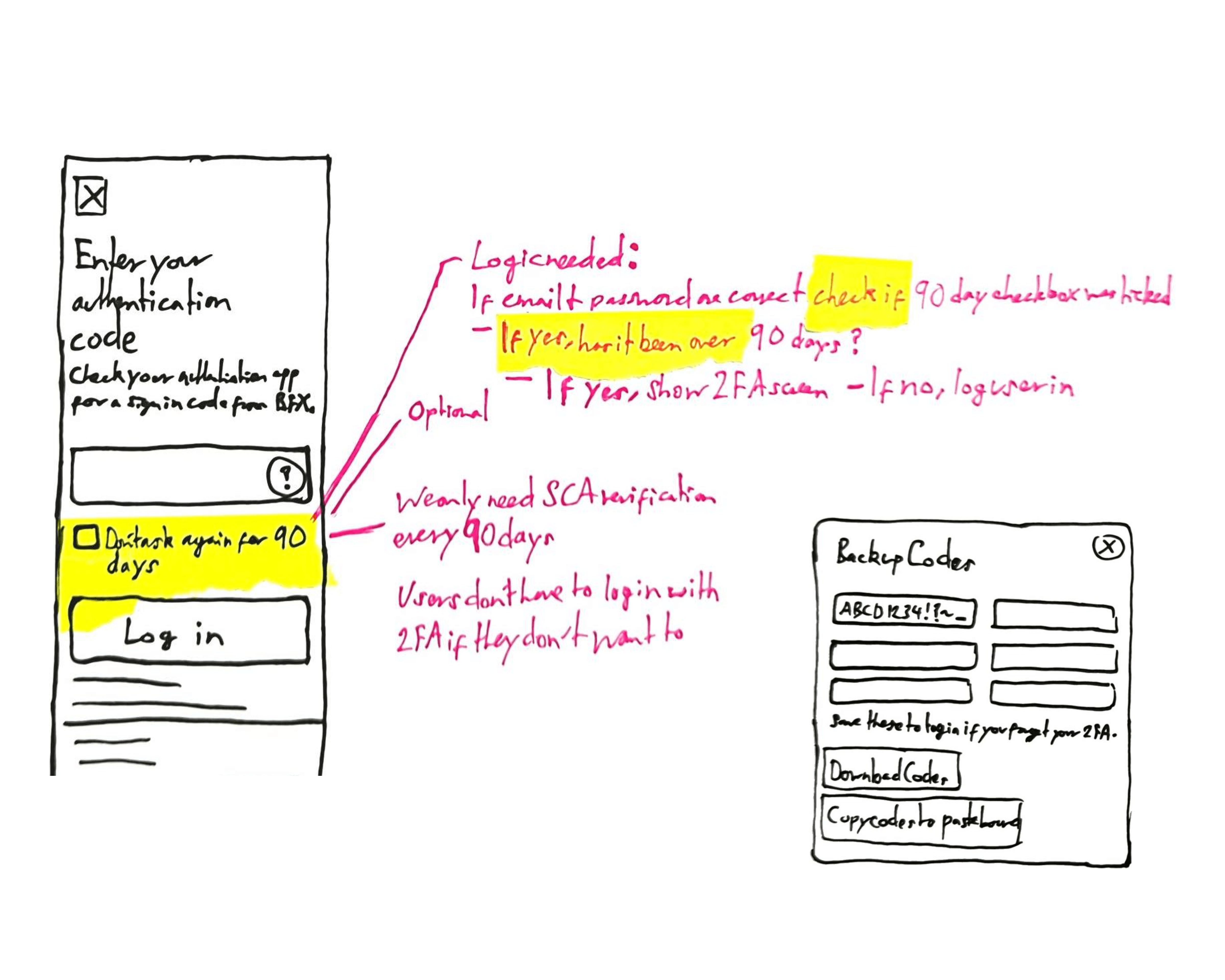
In a paragraph of text, we explained why people had to set up 2FA, because of the FCA’s “Strong Customer Authentication” (SCA) requirement. People either hadn’t read this, were confused, or wanted to know more.
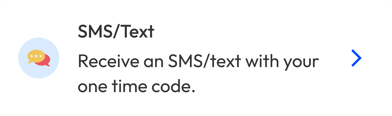
To keep secure, people couldn’t log in with an SMS 2FA code. To keep legally compliant, they couldn’t verify transactions with an app 2FA code.
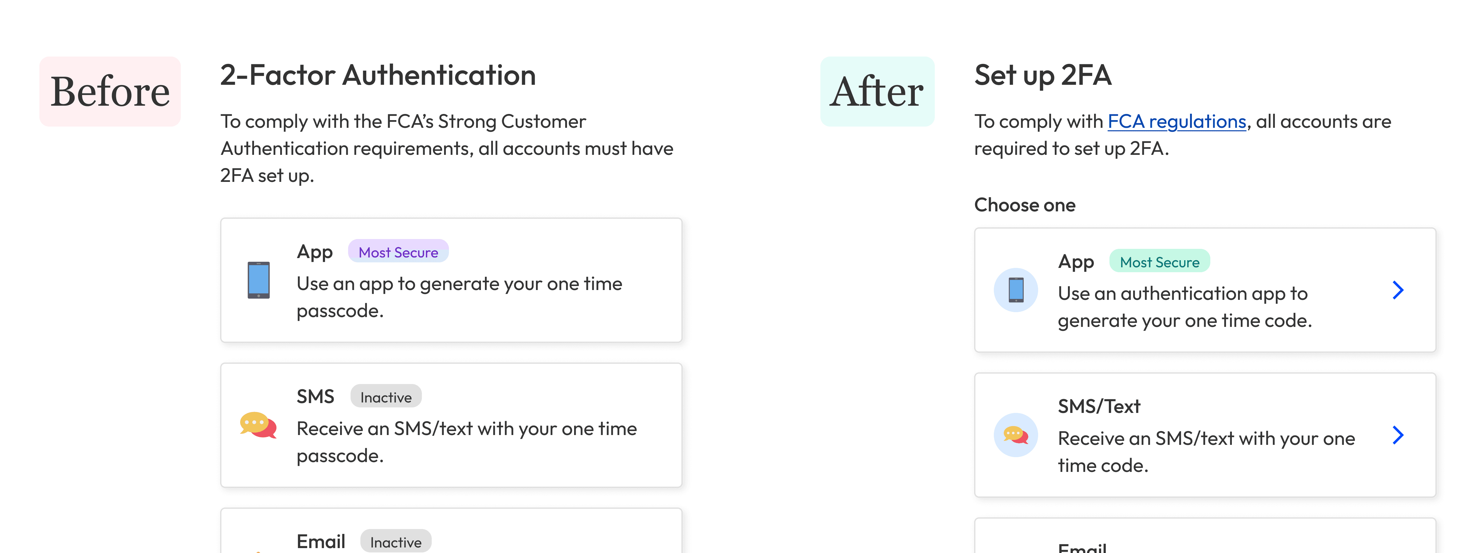
The first design used ticks and crosses to show which methods people could use and when. In practice, this just confused them. They thought the ticks and crosses meant they had or hadn’t completed certain steps.
Different Cultures, Different Expectations
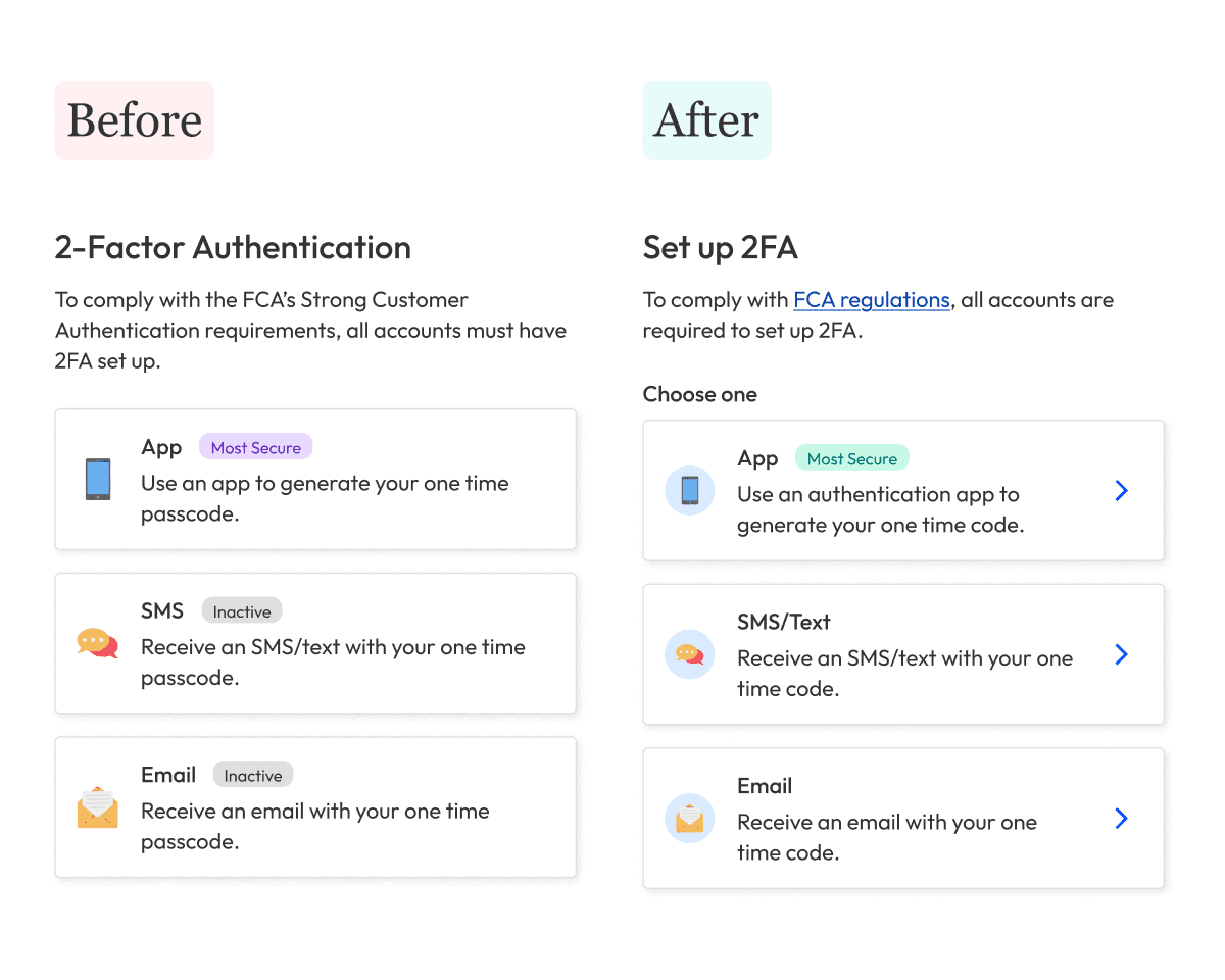
To reduce cognitive load when setting up 2FA, we showed each option as small, clickable cards.
When they got to this step, they took a few seconds to decide which one they wanted to set up, then they did nothing.
Turns out they were expecting two things: instructions and visual cues.
Without calls to action, they didn’t realise they could tap a card to go to the next step; they thought the cards were just purely visual.
Many Small Tasks Are Easier Than Fewer Big Ones
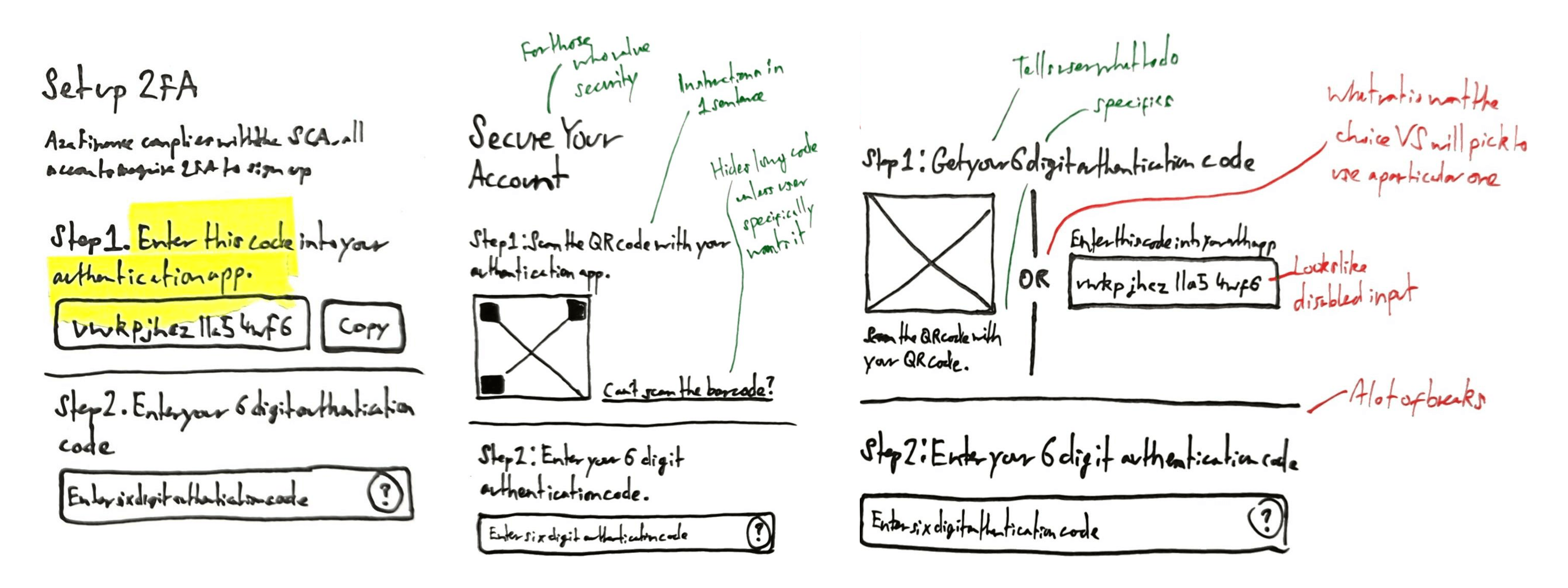
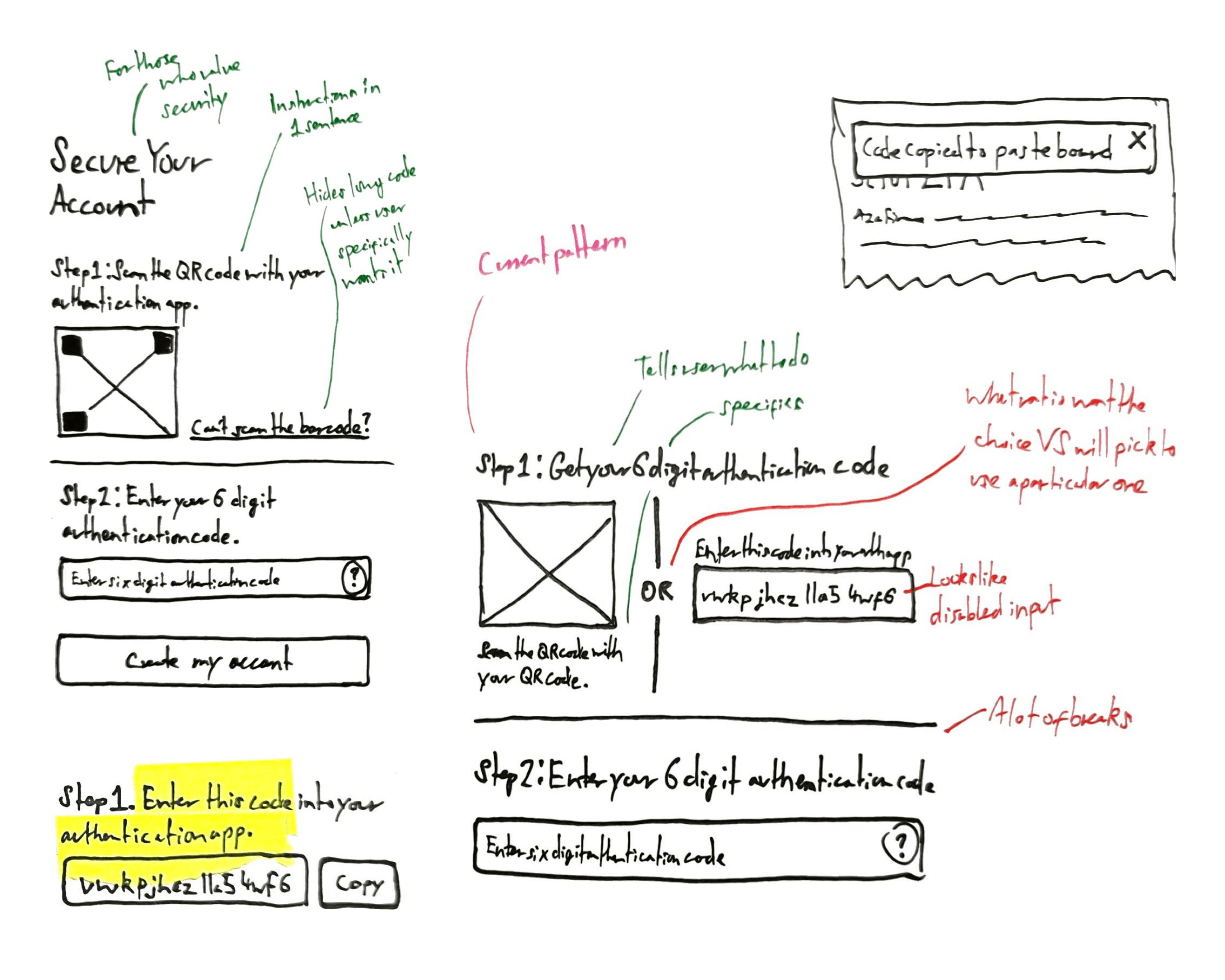
Having rewritten the text to be shorter and clearer, redesigned the setup page to hide the system’s complexity and added calls to action so people knew what to do at each step, when we tested again, most people were happy with the end-to-end flow. The one outlier: setting up app 2FA.
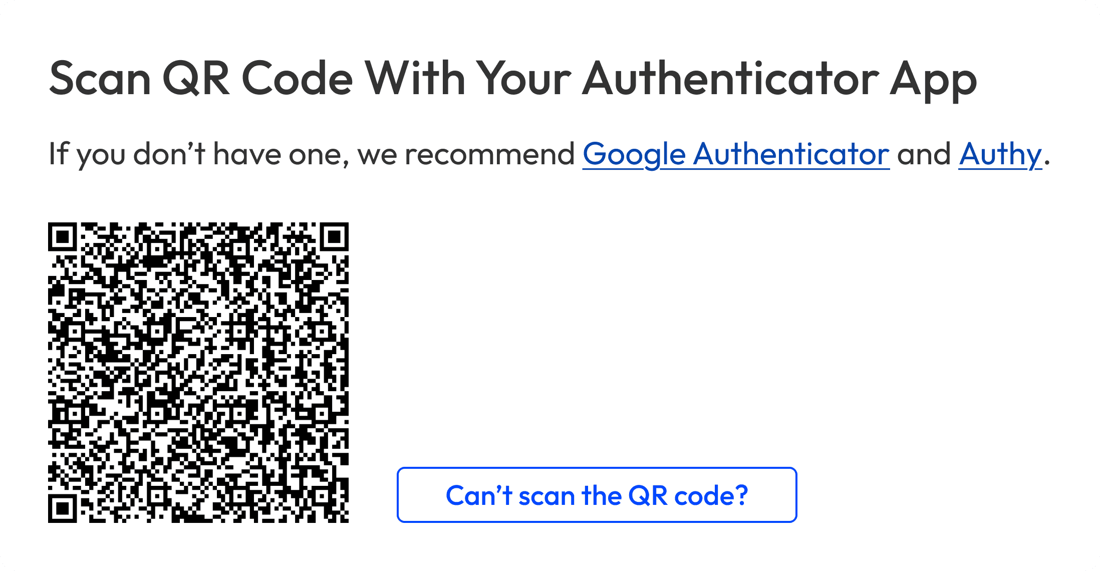
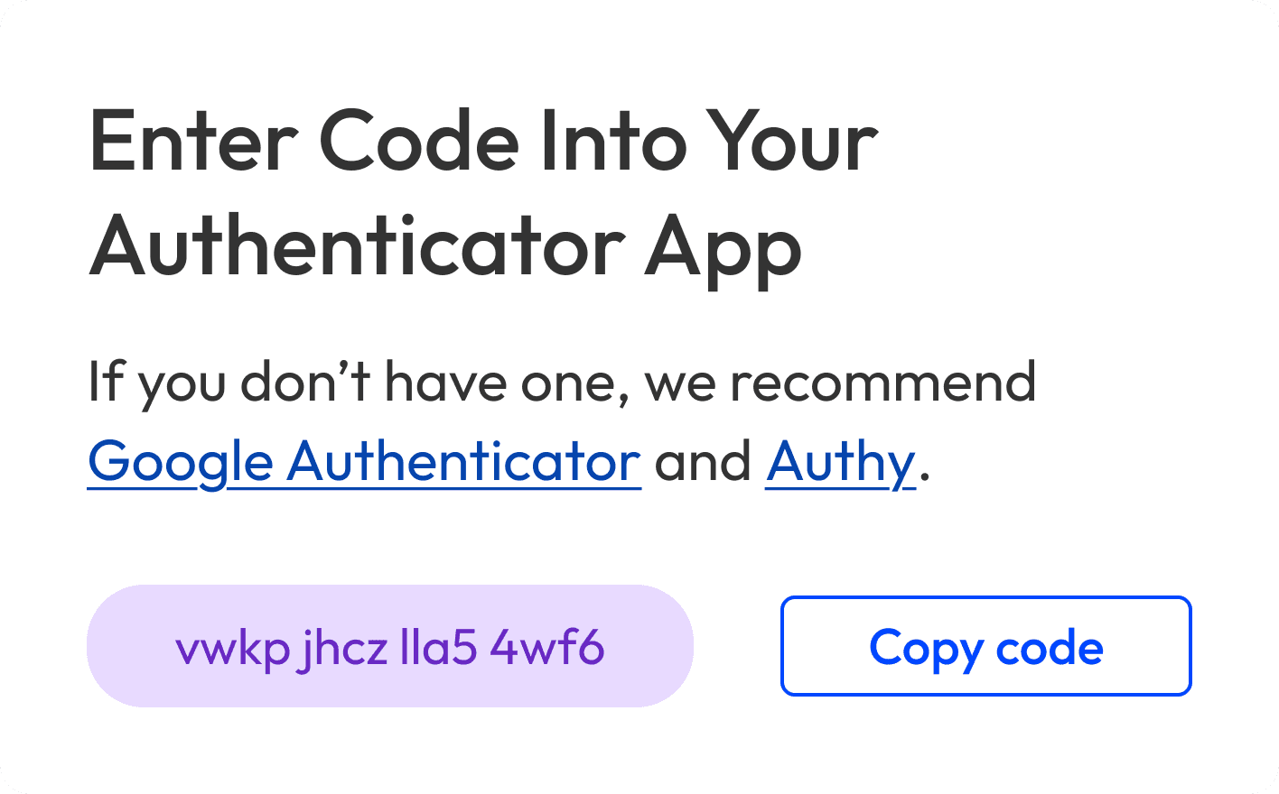
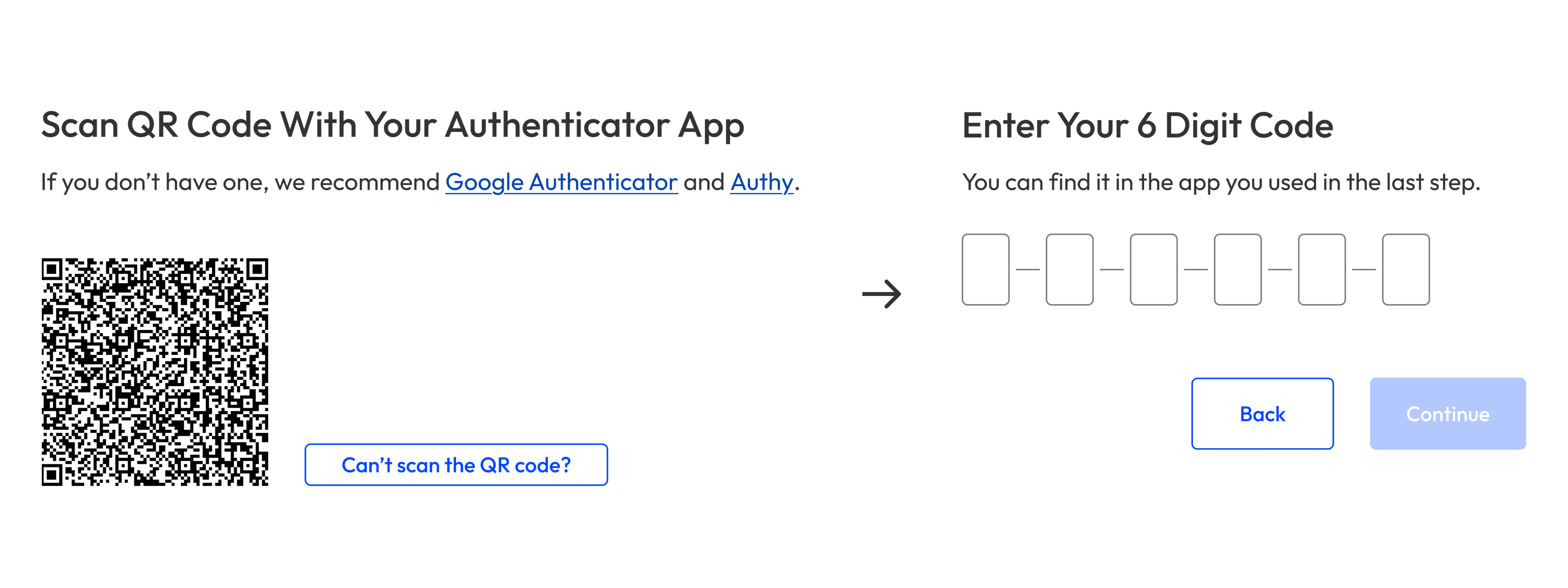
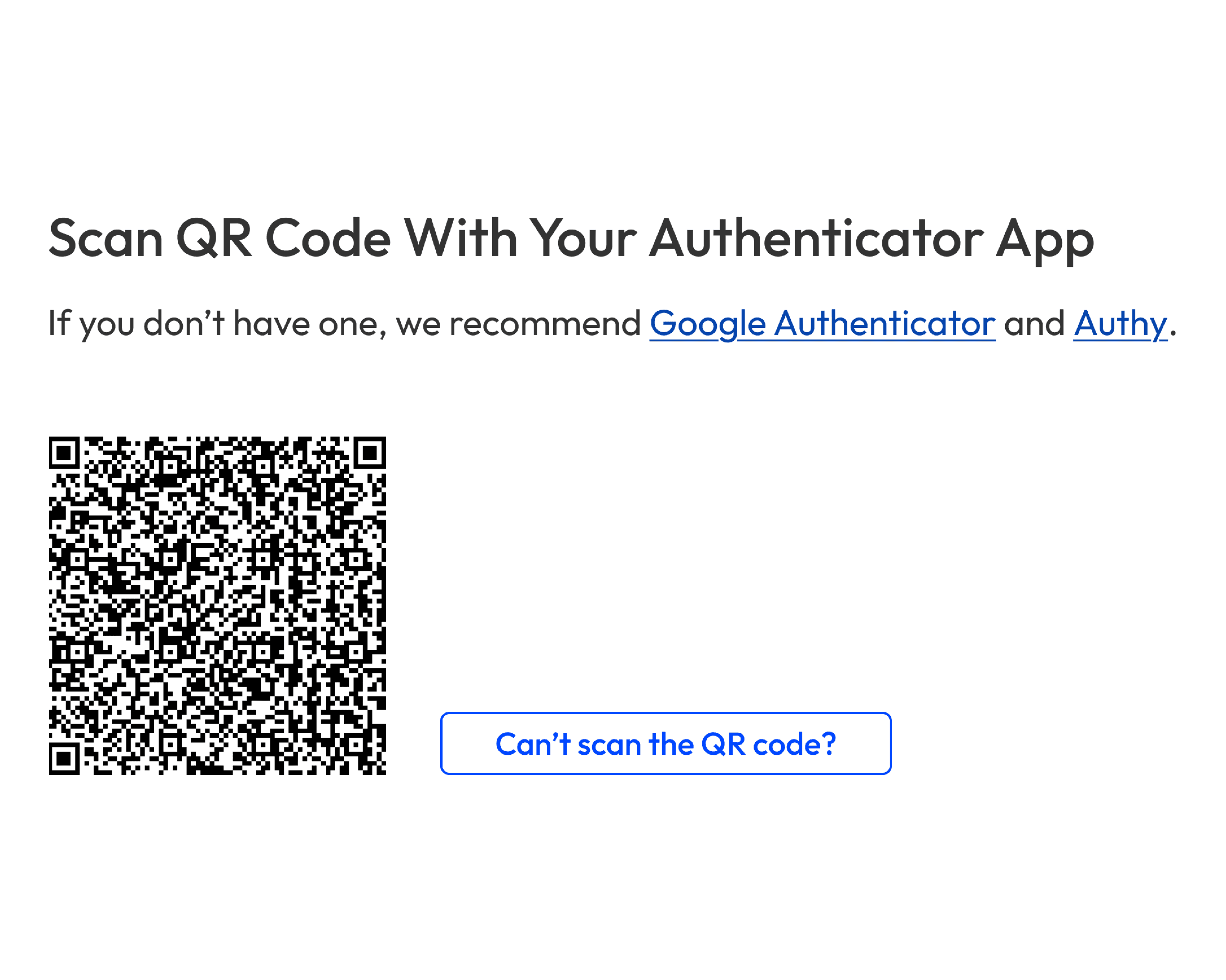
To set up app 2FA on desktop, people had to scan the QR code, then enter the app’s 2FA code back on the product. We thought having both steps on one page would save time; in practice, too much info on the page overwhelmed people.
To reduce cognitive load, we created another version with the steps split over two pages: 1) Scan the QR code, and 2) enter the app’s 2FA code.
Done Is Better Than Perfect
One month before the deadline, we had a solution that everyone was happy with.
It met the FCA’s legal requirements, kept people’s data secure, and was user-friendly. As the project’s scope grew larger than expected, to ensure we shipped on time, we made the tough decision to de-prioritise usability.
Often, when designers push for a good user experience, they do it to reduce risk. If people couldn’t log in or create transactions because 2FA was too complex, the cost would be more than just revenue; it would be our reputation.
Ultimately, the decision came down to two points:
Additionally, to make sure people knew what changes were coming, when, and why, the Customer Service team told people in advance. They even helped some people set up 2FA so they wouldn’t run into any issues when it became mandatory.
Having de-prioritised usability, we launched mandatory 2FA on time and considered the project over. It wasn’t until a few days later that we saw the cost of deprioritising usability.
Working is better than done
On April 1st, people logged in to find they couldn’t make transactions until 2FA was set up. When they tried to set it up, they found they couldn’t for three reasons:
People were frustrated; they had wanted security but not if it made their life more difficult. As their transactions were time-sensitive, and to avoid them using another company, for the next few weeks, Account Managers worked late to make their transactions manually.
Trust, Time, and Money — the Cost of Deprioritising Usability
When a startup is pushing to become profitable, it’s tempting to move fast and improve later. With salaries, maintenance, and various other costs eating up revenue, good usability can be seen as a nice-to-have.
To rebuild trust, we fixed the most important bugs, created a troubleshooting PDF guide, and built the design people were happy with. While the initial launch was rough, when we fast-forward to 2024, people now have very few problems logging in and making transactions with 2FA.
4 Years Wiser — If I Did This Project Today
Looking back on my current experience as a senior product designer, if I were to do this project again, there would be a few things I’d do differently:
When things go wrong, a good team will learn from their mistakes. While the goal was still to become profitable, we would do so by building a good product that people could trust.