A language selector component for people to switch from English to French, or French to English.
An input, dropdown and dropdown menu showing some of many currencies a recipient can be paid in.
A password helper component, when signing up for an account this shows people the password requirements such as a minimum of 10 characters.

From pixel pushers to problem solvers,
how a design system broke siloed teams

Bottom-up project ↑

Bottom-up project ↑

Bottom-up project ↑

DesignOps

DesignOps

DesignOps

Front-end + Product teams

Front-end + Product teams

Front-end + Product teams

Timeline: 6 months (BAU while focussing on other goals)

Timeline:
5 months (3 months full-time, then 2 months part-time post-launch)

User: Internal design, engineering & product teams

User:
West African individuals and businesses making payments to other countries

Photo of christian harries, senior product designer, the guy who this site is about.
Photo of Oluwatobi Akindunjoye, principal product designer.
Photo of Oliver Borders, head of product design. Available to hire.

3x Product Design

Photo of Charles Philip Ukaegbu, senior product manager. Available to hire.

1x PM

Photo of Kevin Kidali, lead front-end dev.
Photo of Damian Cop, front-end dev.
Photo of Łukasz Szyndzielorz, front-end dev.
Photo of Sam Ralak, head of front-end.

4x Front-end

Photo of Elizabeth Nyamu, senior QA engineer. Available to hire.
Photo of Raphael Edwards, head of QA.

2x QA

Photo of Deepika Adusumilli, chief product officer.
Photo of Callum Dryden, chief technical officer.
Photo of Dermot Kilroy, engineering manager.

3x Leadership

The Problem

As the product design team grew from 1 to 3 our different ways of working caused frustrations. 1. Creating a design took longer than necessary. 2. Often we had to create new components from scratch. 3. If we weren’t careful we’d create inconsistent designs, this could lead to a frustrating experience for users.

As the product design team grew from 1 to 3 our different ways of working caused frustrations. 1. Creating a design took longer than necessary. 2. Often we had to create new components from scratch. 3. If we weren’t careful we’d create inconsistent designs, this could lead to a frustrating experience for users.

As the product design team grew from 1 to 3 our different ways of working caused frustrations. 1. Creating a design took longer than necessary. 2. Often we had to create new components from scratch. 3. If we weren’t careful we’d create inconsistent designs, this could lead to a frustrating experience for users.

A messy Figma file with lots of unorganised components.

Messy files led to confusions.

A messy Figma file with lots of unorganised components.

Messy files led to confusions.

A messy Figma file with lots of unorganised components.

Messy files led to confusions.

After a few weeks of frustrating design team calls we realised that having sources of truth would solve a lot of our problems, so we decided to make 2 master Figma files.

Main brand—home for all the logos, colours, and fonts.

Main brand—home for all the logos, colours, and fonts.

Main brand—home for all the logos, colours, and fonts.

Component library—one place for a unified set of design components.

Component library—one place for a unified set of design components.

Component library—one place for a unified set of design components.

The elephant in the room

Two screenshots, one the left, what was designed. On the right, what was built.

Corporate needs you to find the differences between this picture and this picture.

Two screenshots, one the left, what was designed. On the right, what was built.

Corporate needs you to find the differences between this picture and this picture.

Two screenshots, one the left, what was designed. On the right, what was built.

Corporate needs you to find the differences between this picture and this picture.

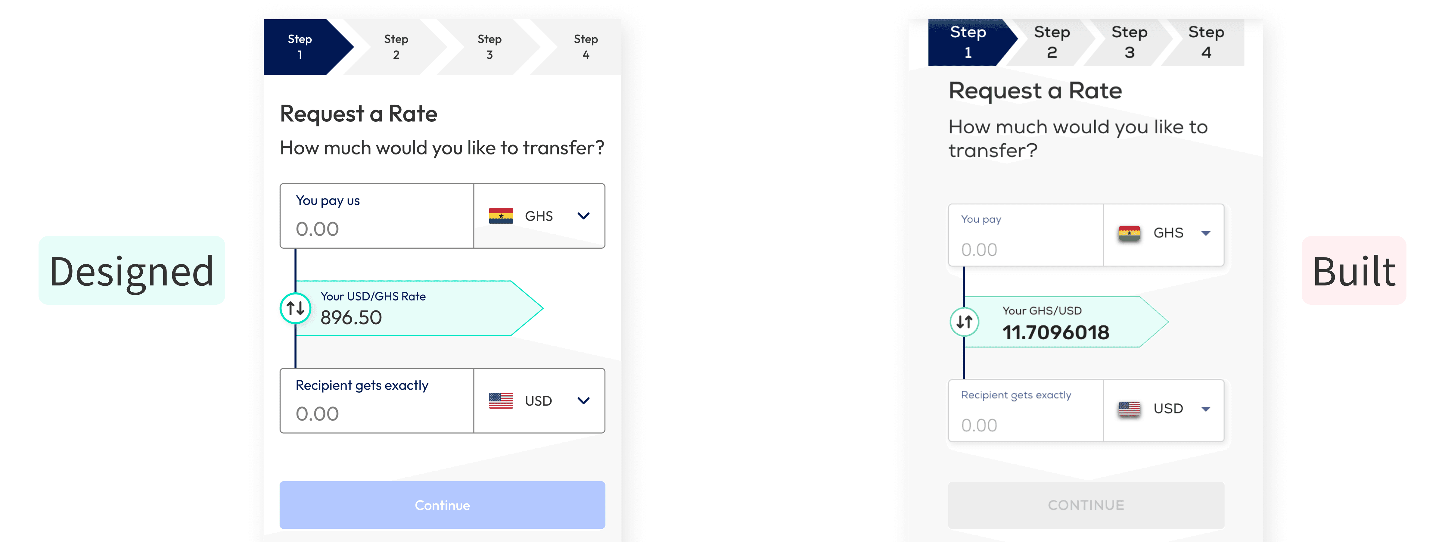
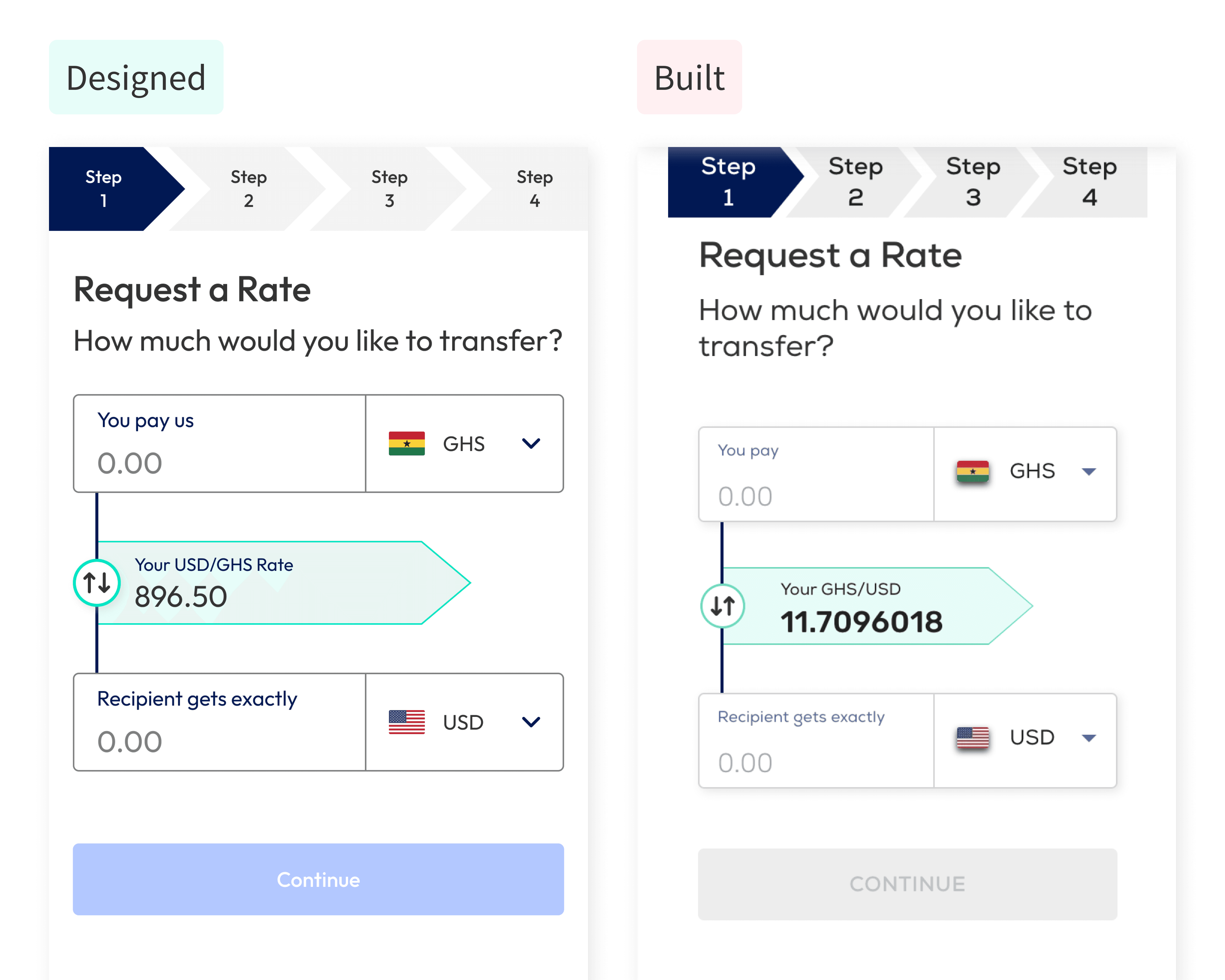
While these files helped us create consistent, high-quality designs quicker one thing still bugged us, what users used very rarely matched our designs.

In Nigeria/Kenya people have been burned by scam businesses, sloppy looking websites look less trustworthy to them.

“If you can’t even get the design right, how can I trust you with my money?”

“If you can’t even get the design right, how can I trust you with my money?”

“If you can’t even get the design right, how can I trust you with my money?”

To solve the problem of production code not matching what we designed we knew we needed to create a design system.

Denial and proof

Photo of a stressed man on his laptop. Photo by Tim Gouw.

Photo by Tim Gouw.

Photo of a stressed man on his laptop. Photo by Tim Gouw.

Photo by Tim Gouw.

Photo of a stressed man on his laptop. Photo by Tim Gouw.

Photo by Tim Gouw.

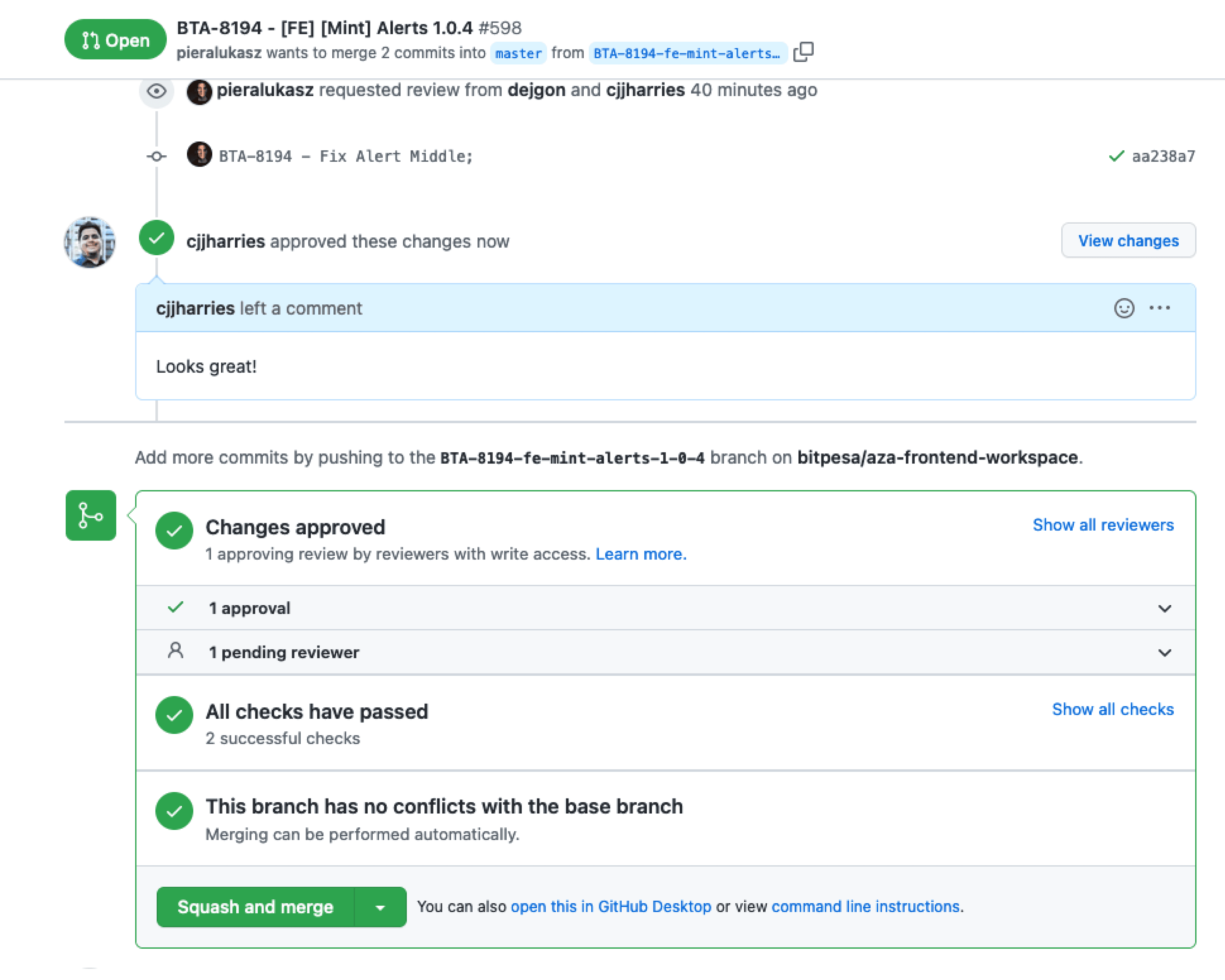
Previously we’d been working in a waterfall environment. Design hands over to PMs and they handle the delivery, it was rare for designers and developers to talk to each other. To break down the siloes we set up a weekly call with people from Product Design, Front-end development and QA.

At first we found our different mental models colliding, developers thought we were over-reacting about small things like the wrong shade of a colour or a slightly misaligned button. To understand how big of an issue designs and code not matching was we set up a little experiment.

Over 2 weeks, 75% of front-end tickets that made it to production didn’t match the acceptance criteria.

Over 2 weeks, 75% of front-end tickets that made it to production didn’t match the acceptance criteria.

Over 2 weeks, 75% of front-end tickets that made it to production didn’t match the acceptance criteria.

This data was a real eye opener for developers and QA, when we dug into why this happened we found 3 main problems:

Tickets weren’t well defined

Often the scope was larger than developers originally thought and when writing tickets PMs misunderstood design expectations.

Tickets weren’t well defined

Often the scope was larger than developers originally thought and when writing tickets PMs misunderstood design expectations.

Tickets weren’t well defined

Often the scope was larger than developers originally thought and when writing tickets PMs misunderstood design expectations.

Devs felt pressured to deliver quickly

Acceptance criteria was skipped or built poorly to deliver work quicker. This impacted code quality and made prioritising non-critical bugs/improvements hard.

Devs felt pressured to deliver quickly

Acceptance criteria was skipped or built poorly to deliver work quicker. This impacted code quality and made prioritising non-critical bugs/improvements hard.

Devs felt pressured to deliver quickly

Acceptance criteria was skipped or built poorly to deliver work quicker. This impacted code quality and made prioritising non-critical bugs/improvements hard.

Inconsistent review process

PMs didn't review pull requests. When devs reviewed their peers work, they prioritised functionality over quality and usability.

Inconsistent review process

PMs didn't review pull requests. When devs reviewed their peers work, they prioritised functionality over quality and usability.

Inconsistent review process

PMs didn't review pull requests. When devs reviewed their peers work, they prioritised functionality over quality and usability.

Negative conversations can be hard to have, but by ensuring everyone knew this wasn’t about blaming we were able to maturely discuss how we’d found a problem and now as a cross-collaborative team we wanted to fix it.

Seeing the world the same way

A document that shows what I'm good at, what I'm not good at, and how to work with me.

Reflecting on how I work to understand how I can improve.

A document that shows what I'm good at, what I'm not good at, and how to work with me.

Reflecting on how I work to understand how I can improve.

A document that shows what I'm good at, what I'm not good at, and how to work with me.

Reflecting on how I work to understand how I can improve.

As product design, front-end and QA were previously siloed the first few weeks of calls focussed on how we’d best work together.

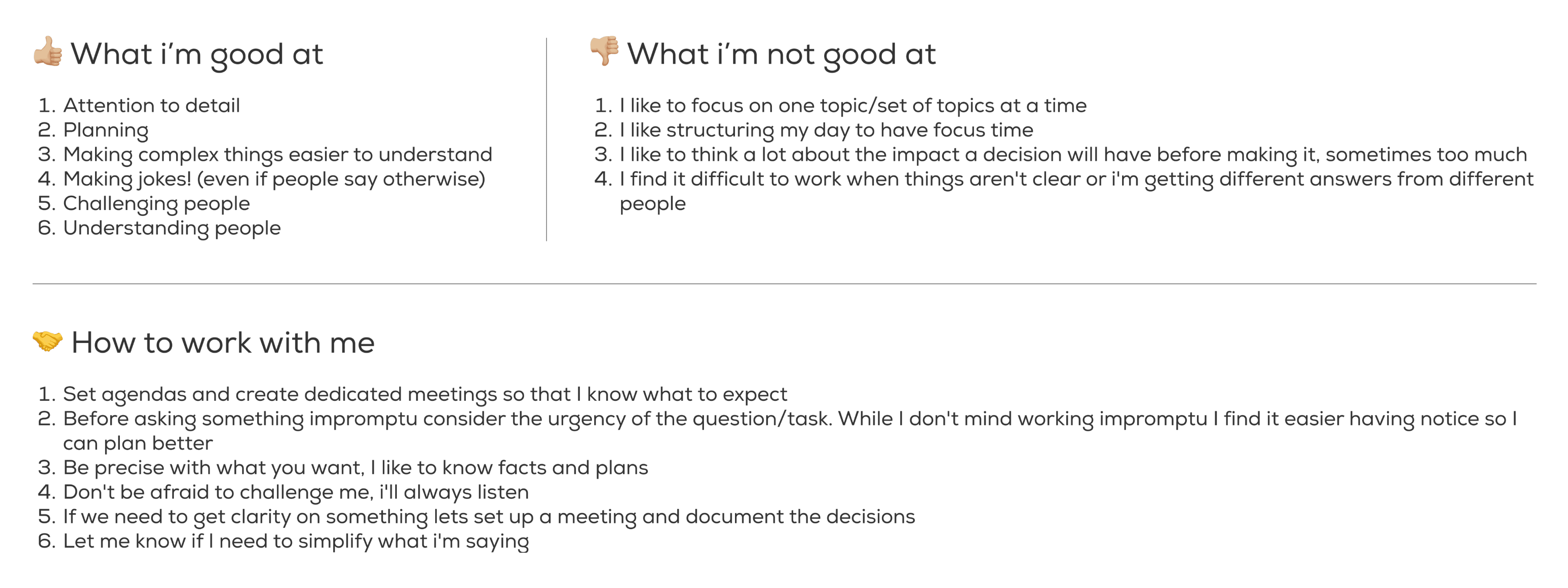
Leveraging Monzo’s “Working with me” document we each presented 1) What I’m good at, 2) What I’m not good at, 3) How to work with me.

Additionally we showed our Myers’ Briggs Personality Type and created a safe space to openly share both quick wins and bigger frustrations:

Tickets were confusing and inconsistent

We listened to people’s concerns and collaboratively made a ticket template that everyone was happy with.

Tickets were confusing and inconsistent

We listened to people’s concerns and collaboratively made a ticket template that everyone was happy with.

Tickets were confusing and inconsistent

We listened to people’s concerns and collaboratively made a ticket template that everyone was happy with.

Designers know how to use Figma, but front-end/QA don’t

To make them feel more comfortable we ran a workshop showing step by step how to inspect designs with the inspector panel (this was pre-dev mode), got them to complete inspection challenges live on a call and created a “How to” guide for them to rewatch if they needed to.

Too many design files made it hard to know which were the right ones

To tackle this we made 3 small but significant changes, future Figma files would each have; 1) The same name as the development ticket it was associated with to ensure people knew they were looking at the right file, 2) A specific “Final design” page for people to know what designs needed to be worked, 3) A front-cover that showed the project’s status, date the design was started and the designer who worked on it.

Knowing the present to shape the future

Screenshot of the log in page with post it note annotations of the current type styles.

42 different type styles across the product!

Screenshot of the log in page with post it note annotations of the current type styles.

42 different type styles across the product!

Screenshot of the log in page with post it note annotations of the current type styles.

42 different type styles across the product!

Before we could talk about how we’d build a design system we took a step back to understand how our current system worked.

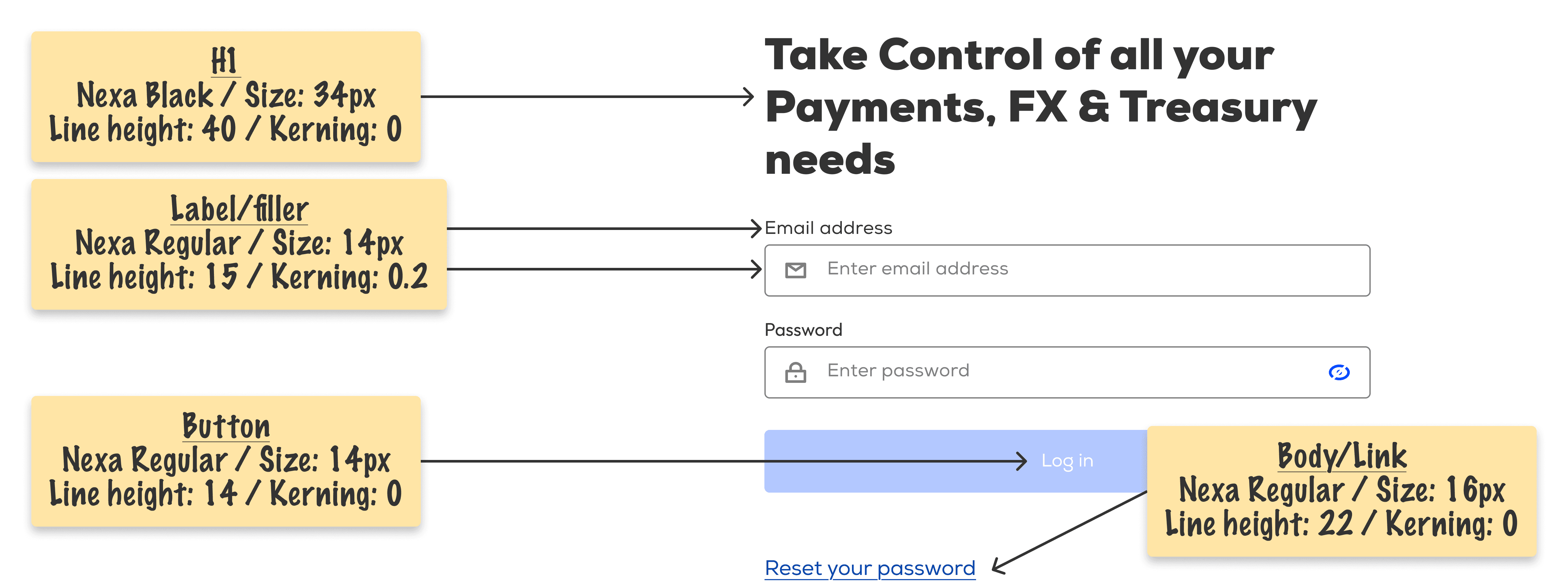
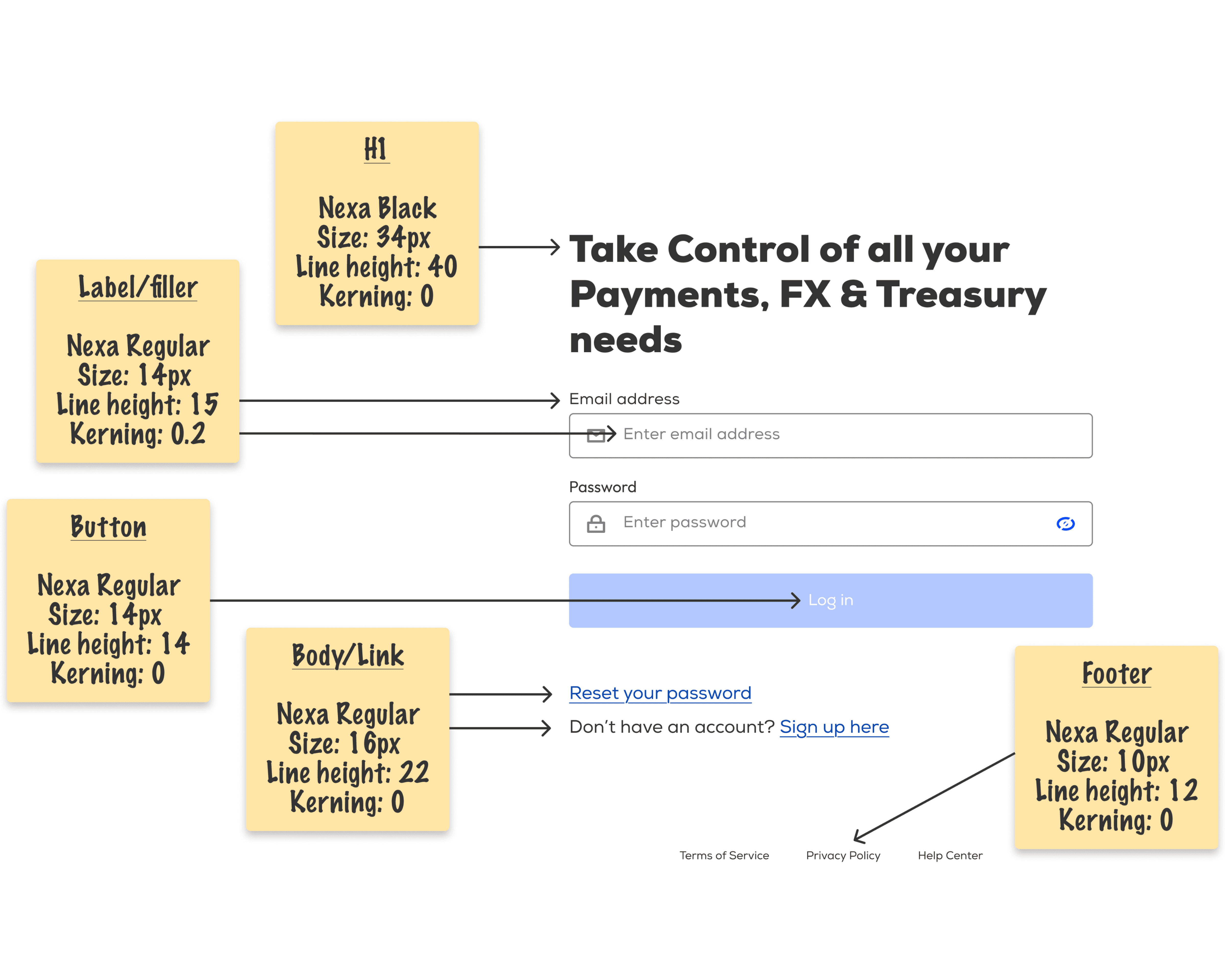
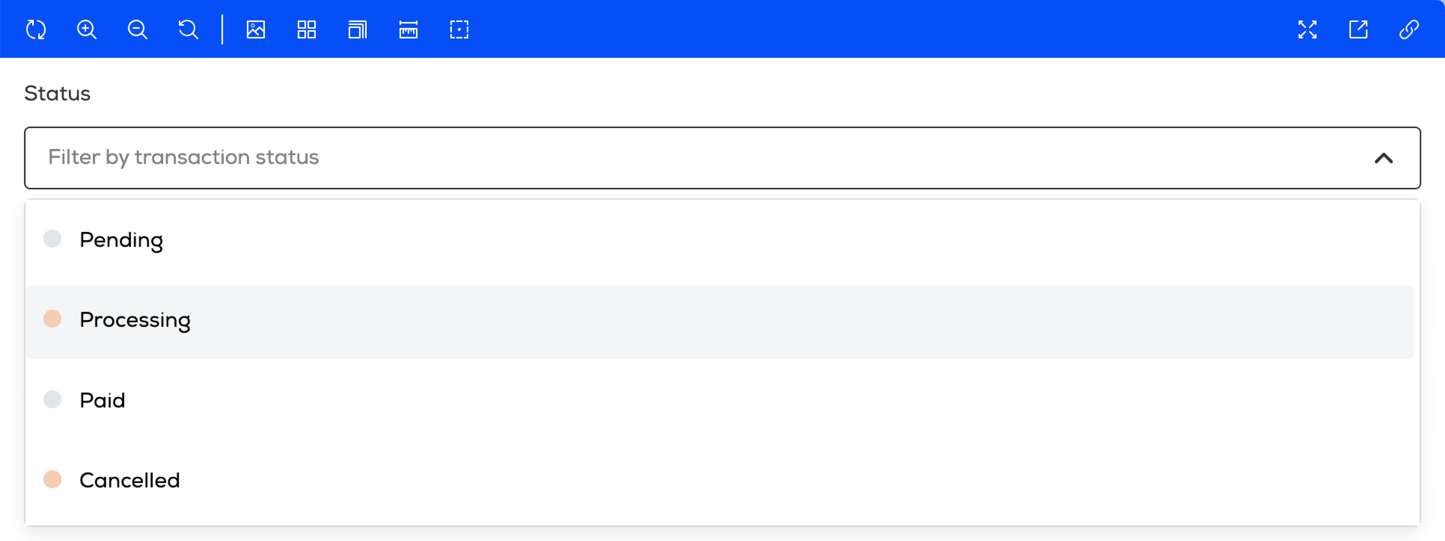
After auditing our colours, type and components we found many inconsistencies we could fix by standardising new styles and rules in our Figma component library.

As we dug deeper we found ourselves asking some very important questions that would shape the way we’d build our design system:

Scalability

At the time we had 1 product, would we need to build the design system to cater for multiple products with different brands and users? Spoiler alert, we built it with scalability in mind

Scalability

At the time we had 1 product, would we need to build the design system to cater for multiple products with different brands and users? Spoiler alert, we built it with scalability in mind

Scalability

At the time we had 1 product, would we need to build the design system to cater for multiple products with different brands and users? Spoiler alert, we built it with scalability in mind

Structure

Did we want to build the design system from scratch and have more flexibility or leverage a component library and work within its limitations? Spoiler alert, we built it on top of Material Design

Structure

Did we want to build the design system from scratch and have more flexibility or leverage a component library and work within its limitations? Spoiler alert, we built it on top of Material Design

Structure

Did we want to build the design system from scratch and have more flexibility or leverage a component library and work within its limitations? Spoiler alert, we built it on top of Material Design

Perhaps the biggest question though was around the scope, what’s our MVP?

Screenshot of how we prioritised which components to work on. The highest priority ones were used in 50%+ of pages or would be needed to build a new product.

Putting the “product” in product design.

Screenshot of how we prioritised which components to work on. The highest priority ones were used in 50%+ of pages or would be needed to build a new product.

Putting the “product” in product design.

Screenshot of how we prioritised which components to work on. The highest priority ones were used in 50%+ of pages or would be needed to build a new product.

Putting the “product” in product design.

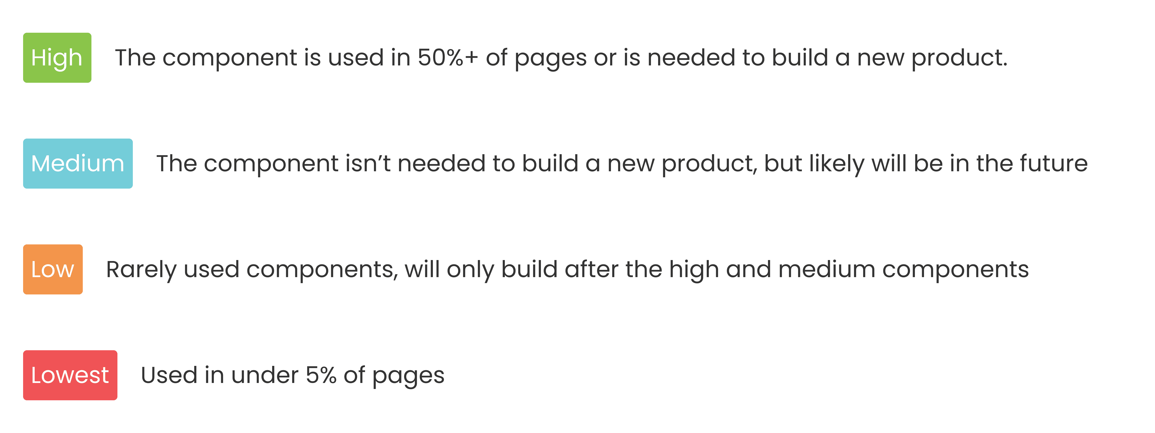
Getting priority to build 60+ components wouldn’t be easy, any time spent building the design system would be time away from solving other important user/business problems. With this in mind we defined the MVP based on 3 things.

With this in mind we defined the MVP based on 3 things:

What are our most commonly used components?

What are our most commonly used components?

What are our most commonly used components?

What would we need to build a new product?

What would we need to build a new product?

What would we need to build a new product?

Following Brad Frost’s atomic design methodology, what atoms would help us build more complex components in the future?

Following Brad Frost’s atomic design methodology, what atoms would help us build more complex components in the future?

Following Brad Frost’s atomic design methodology, what atoms would help us build more complex components in the future?

With this in mind we decided the MVP would focus on the 25 core components users needed to sign up, log in and onboard with us. Once we’d proved the value of the design system we’d get priority for creating the rest of the components in our transaction flow and other ancillary pages.

Anyone can be a designer

While front-end devs researched how to build the MVP with scalability in mind, product designers prioritised and estimated the effort to design each of the 25 MVP components.

Over the next few months each product designer created working Figma components which we demoed in our weekly team calls.

As well as ensuring we had a consistent visual language and user experience the demos helped in 2 other ways:

We learned what would/wouldn’t work

As designers who had limited coding knowledge we saw some designs had technical assumptions in them that we didn’t realise until front-end/QA gave us feedback.

We learned what would/wouldn’t work

As designers who had limited coding knowledge we saw some designs had technical assumptions in them that we didn’t realise until front-end/QA gave us feedback.

We learned what would/wouldn’t work

As designers who had limited coding knowledge we saw some designs had technical assumptions in them that we didn’t realise until front-end/QA gave us feedback.

Front-end/QA felt like part of the team

As they were usually focussed on delivery they didn’t have many chances to pitch their own ideas of how to solve problems.

Front-end/QA felt like part of the team

As they were usually focussed on delivery they didn’t have many chances to pitch their own ideas of how to solve problems.

Front-end/QA felt like part of the team

As they were usually focussed on delivery they didn’t have many chances to pitch their own ideas of how to solve problems.

As an exec, I want to …, so that …

Photo of me presenting to stakeholders.

As designers we empathise with users all the time, why not stakeholders too?

Photo of me presenting to stakeholders.

As designers we empathise with users all the time, why not stakeholders too?

Photo of me presenting to stakeholders.

As designers we empathise with users all the time, why not stakeholders too?

After several months of iteration we completed our Figma component library. With this, a front-end development plan and a bit of prioritisation it was time to get exec buy-in for building the design system in code.

At the start of the project the design team felt undervalued. I was frustrated with PMs and execs always deprioritising good user experiences, until one day I asked myself “why?”.

To better understand the PM and exec mindset I took a 6-week course in Product Management and Strategy. Throughout the course I learned lots of great skills around research, prioritisation and defining success metrics, but perhaps the greatest thing I learned was the idea of Mental Models.

It sounds obvious when you say it but people are different. Our different experiences, upbringings and skillsets mean we see the world in very different ways.

Let’s put on our empathy hat for a sec and imagine PMs and execs as users, what are their goals and desires, what challenges are they facing, how do they view the world?

As an executive, I want the company to reach profitability, so that it’s financially stable.

As an executive, I want the company to reach profitability, so that it’s financially stable.

As an executive, I want the company to reach profitability, so that it’s financially stable.

With this perspective it’s understandable why UX was being deprioritised. To get priority for building the design system we reframed the project to what decision makers considered valuable.

With a design system we:

Ship quality code faster

Ship quality code faster

Ship quality code faster

Spend less time spent fixing bugs/missed acceptance criteria

Spend less time spent fixing bugs/missed acceptance criteria

Spend less time spent fixing bugs/missed acceptance criteria

Have a cleaner, more scalable code base

Have a cleaner, more scalable code base

Have a cleaner, more scalable code base

Can make new, experimental products quicker

The last time we tried to make a new product in 3 months, it took over 6 months.

Can make new, experimental products quicker

The last time we tried to make a new product in 3 months, it took over 6 months.

Can make new, experimental products quicker

The last time we tried to make a new product in 3 months, it took over 6 months.

Have a more trustworthy looking brand that appeals to our African business users

Remember, they’ve been burned by scams before, “If you can’t even get the design right, how can I trust you with my money?”

Have a more trustworthy looking brand that appeals to our African business users

Remember, they’ve been burned by scams before, “If you can’t even get the design right, how can I trust you with my money?”

Have a more trustworthy looking brand that appeals to our African business users

Remember, they’ve been burned by scams before, “If you can’t even get the design right, how can I trust you with my money?”

After solidifying our pitch, one by one we got buy-in from the heads. The head of QA, Front-end, product design and both the head PM/engineering manager for the customer-facing products. With the heads having bought into the project we got buy-in from both the CPO and CTO. This project was actually going to happen!

From planning to doing, the building of a design system

Screenshot of me approving a pull request of an alert component being created.

Git-ting stuck in… badum tish.

Screenshot of me approving a pull request of an alert component being created.

Git-ting stuck in… badum tish.

Screenshot of me approving a pull request of an alert component being created.

Git-ting stuck in… badum tish.

To ensure the design system went from Figma to code as expected, front-end devs taught the product design team:

Basic git — how to pull a branch, switch to another branch etc.

Basic git — how to pull a branch, switch to another branch etc.

Basic git — how to pull a branch, switch to another branch etc.

How to review a Pull Request.

How to review a Pull Request.

How to review a Pull Request.

Best practices for reviewing PRs.

Best practices for reviewing PRs.

Best practices for reviewing PRs.

As colour and type are the foundation of any design system we started with them, then 1 by 1 we created and prioritised tickets for each of the MVP’s 25 components.

Since this project would be the first time product design and front-end/QA worked so closely together, to ensure smooth collaboration we set up our own retros, planning and check-in sessions, as having an open door for anyone to ask any questions as and when they popped up.

Design as a service → Integrated design

Screenshot of my gihub code contributions.

In 2.5 years I’ve made 348 Github contributions to ensuring high quality front-end delivery.

Screenshot of my gihub code contributions.

In 2.5 years I’ve made 348 Github contributions to ensuring high quality front-end delivery.

Screenshot of my gihub code contributions.

In 2.5 years I’ve made 348 Github contributions to ensuring high quality front-end delivery.

After 5 months of working hand-in-hand with front-end devs/QA we achieved our goal of creating an MVP design system — everything we needed to deliver user-friendly, technically scalable products quicker. Check it out at here.

Looking back, we went from a waterfall environment where product design and development/QA didn’t talk, to designers being a valued and integral part of the delivery process.

A second elephant in the room

Soon after launching we knew there was 1 more issue we needed to address, developers/QA were getting frustrated by the ever-growing mountain of tech debt that they never had the time to fix.

Previously we thought we could launch a new product in 3 months, it ended up taking over 6 months.

“The longer we avoid it, the harder it’s going to be for us to scale in the future” —Lead front-end developer: Kevin Kidali

“The longer we avoid it, the harder it’s going to be for us to scale in the future” —Lead front-end developer: Kevin Kidali

“The longer we avoid it, the harder it’s going to be for us to scale in the future” —Lead front-end developer: Kevin Kidali

Having proved the value of operational efficiency projects with the design system we kept up our momentum and piece by piece refactored our React applications, and shortly after, the product design team made the jump from waterfall to scrum.

2 years later: The value of a design system

Screenshot of a component in storybook.

Design system hosted on Storybook

Screenshot of a component in storybook.

Design system hosted on Storybook

Screenshot of a component in storybook.

Design system hosted on Storybook

We’re now delivering higher quality experiences faster:

Before, it took us 6+ months to launch a new product, if we were to launch that same product again today, it would take 2 months.

Before, it took us 6+ months to launch a new product, if we were to launch that same product again today, it would take 2 months.

Before, it took us 6+ months to launch a new product, if we were to launch that same product again today, it would take 2 months.

The design system has tripled in size from 25 to 75 components.

The design system has tripled in size from 25 to 75 components.

The design system has tripled in size from 25 to 75 components.

We’ve gone from implementing the design system on 50% of one user-facing product to 100% of 3 user-facing products. We’ve even started implementing it in our internal Admin product to ensure a good experience for staff.

We’ve gone from implementing the design system on 50% of one user-facing product to 100% of 3 user-facing products. We’ve even started implementing it in our internal Admin product to ensure a good experience for staff.

We’ve gone from implementing the design system on 50% of one user-facing product to 100% of 3 user-facing products. We’ve even started implementing it in our internal Admin product to ensure a good experience for staff.

What we learned

While creating a design system we learned lots of great hard skills from best practices for auto-layout to prioritising work, the most valuable skills we learned though were not hard skills but soft skills.

People have different mental models of how the world works

Saying “we need a design system to ensure consistent & user-friendly experiences” makes sense to us as designers, but showing execs the quantitative impact of having a design system is what got us approval to spend development time creating it.

Treat people as people, not staff

As designers were siloed away from developers/QA we initially felt like our work wasn’t being valued, when we took the time to get to know each other as people the barriers between our teams started coming down and we were able to have difficult conversations in a mature way.

If we could do the project again I’d focus more on measuring quantitative than qualitative.

Our users don’t trust a sloppy looking product but how has implementing a professional looking interface impacted users’ view of us? Showing users trust before and after with an NPS/SUS/SEQ score would cement the design system’s value to execs more than user quotes.

Our users don’t trust a sloppy looking product but how has implementing a professional looking interface impacted users’ view of us? Showing users trust before and after with an NPS/SUS/SEQ score would cement the design system’s value to execs more than user quotes.

Our users don’t trust a sloppy looking product but how has implementing a professional looking interface impacted users’ view of us? Showing users trust before and after with an NPS/SUS/SEQ score would cement the design system’s value to execs more than user quotes.

‘Over 2 weeks, 75% of front-end tickets that made it to production didn’t match the acceptance criteria’ was a powerful metric, if we showed the monthly average before and after implementing the design system it would further prove the project’s value.

‘Over 2 weeks, 75% of front-end tickets that made it to production didn’t match the acceptance criteria’ was a powerful metric, if we showed the monthly average before and after implementing the design system it would further prove the project’s value.

‘Over 2 weeks, 75% of front-end tickets that made it to production didn’t match the acceptance criteria’ was a powerful metric, if we showed the monthly average before and after implementing the design system it would further prove the project’s value.

Screenshot of Nielsen Norman's 6 stages of UX maturity.

Nielsen Norman’s 6 stages of UX maturity.

Screenshot of Nielsen Norman's 6 stages of UX maturity.

Nielsen Norman’s 6 stages of UX maturity.

Screenshot of Nielsen Norman's 6 stages of UX maturity.

Nielsen Norman’s 6 stages of UX maturity.

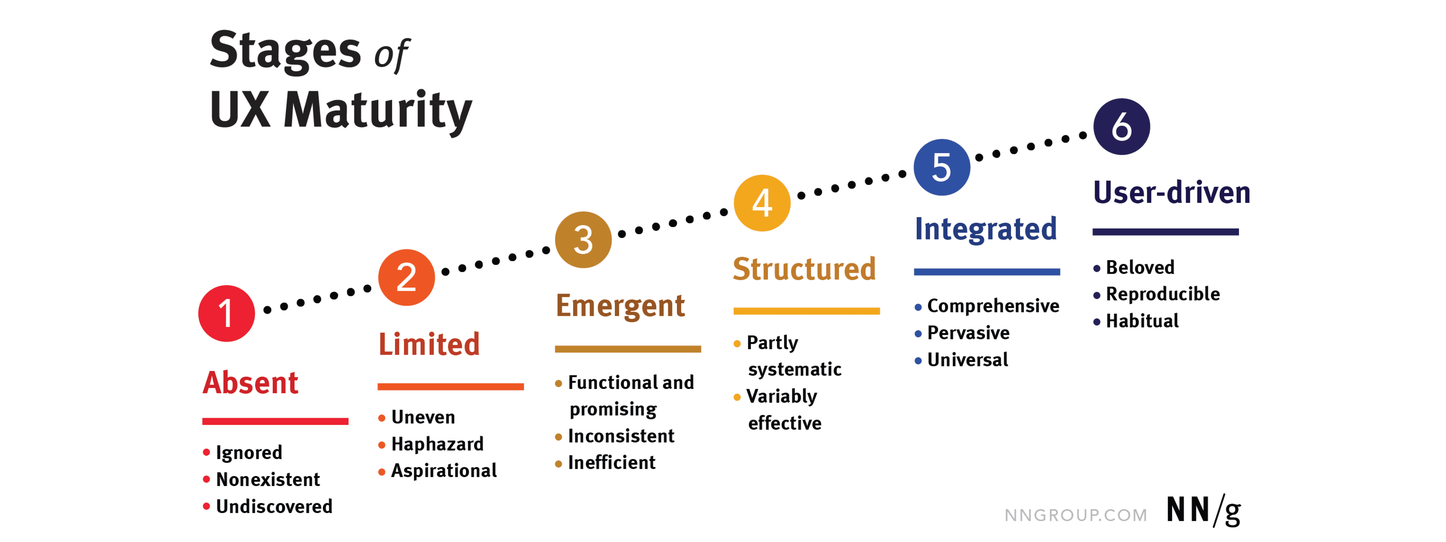
It’s amazing to see just how big of an impact this project had on the way the business approaches product development. We went from ‘Limited’ UX Maturity to ‘Emergent’ and over time we’re even getting closer to being ‘Structured’.

Let's connect

Christian Harries © 2025 (and beyond)

Create a free website with Framer, the website builder loved by startups, designers and agencies.